
How Much Blur Is Enough? A Practical Guide to Blur Strength
A light blur can leave text readable. Learn how to choose blur strength based on font size, image resolution and the size you plan to post at.
November 5, 2026|Toolbox Image|#blur-strength #redaction#blur-image#image-tools
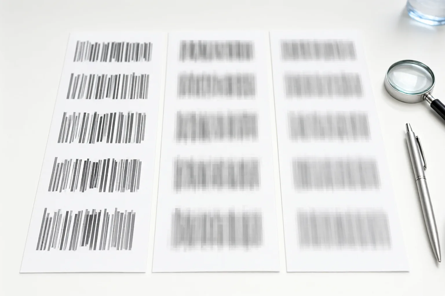
How Much Blur Is Enough? A Practical Guide to Blur Strength
Two people blur the same name. One exports an image where the letters are still legible; the other turns the area into an unreadable smudge. The difference is not the tool — it is the strength, and strength is relative to the pixels underneath.
A blur that hides a large headline will not hide 8-point type on a 4000-pixel-wide screenshot. This guide gives you a working rule for choosing strength, plus a two-zoom check that catches almost every under-blurred region.
Quick Takeaways
-
Blur strength is measured against feature size: small text needs a much wider blur radius than a face or a logo.
-
As a rule of thumb, the blur radius should exceed the stroke width of the characters by several times.
-
Use Toolbox Image and check the result at 100% zoom, then again at the size you will post.
-
For structured data — barcodes, QR codes, account numbers — skip blur and use a solid block.
-
Downscaling can make edges look sharper, so never judge strength only in a small preview.
Why a Light Blur Fails
Gaussian blur spreads each pixel over a radius. If that radius is smaller than the gap between two letters, the contrast at each edge drops but the letter shapes survive. Human vision is very good at reconstructing high-contrast shapes, and OCR is better still.
| Content type | Typical feature size | Safe approach |
|---|---|---|
| Large headline or logo | 30–80 px | Medium blur usually enough |
| Body text in a document | 10–20 px | Strong blur, or a solid block |
| Tiny print on a receipt or badge | 4–10 px | Solid block — blur is unreliable |
| Barcode / QR code | 2–6 px bars | Solid block over the whole symbol |
| A face | Hundreds of px | Medium-to-strong blur or mosaic |
| A licence plate | 15–40 px characters | Strong blur or a solid block |
The smaller the detail, the more aggressively you need to mask it. That is the opposite of what most people do: they apply a gentle blur precisely because the item is small and they want to “keep the photo natural.”
A Working Rule for Blur Strength
-
Estimate the stroke width. Zoom to 100% and look at the thickness of a letter stroke or a barcode bar in pixels.
-
Set the radius well above it. A blur radius several times the stroke width removes the shape rather than softening it. If your tool exposes a strength slider, push it until the characters merge into a continuous smudge.
-
Prefer two passes over one weak pass. A second application of a moderate blur is often more effective than hunting for a perfect single setting.
-
Widen the selection. A strong blur applied to a tight box leaves sharp text right outside the edge. Give the mask a generous margin.
-
Verify at two zooms. Check at 100% for leftover letter shapes, then at the display size for stray fragments.
-
Use a block for anything machine-readable. See pixelate vs. blur for why mosaic squares can also be reversed on text, and blur vs. redact for the document-level decision.
Toolbox Image lets you switch between Gaussian blur and mosaic in the same selection, which makes this comparison quick: apply one, look at 100%, undo, apply the other.
The Resolution Trap
A 12-megapixel photo contains far more detail than the 1080-pixel version you post. Two consequences follow:
-
Blurring at full resolution first is safer. If you downscale first, small text becomes a few crisp pixels that a light blur may not fully dissolve.
-
Downscaling is not a substitute for masking. Shrinking an image hides detail from a casual glance, but edge contrast often survives. Never treat resizing as redaction.
The resize image guide covers the sizing side; the crop, resize, then blur workflow explains the correct order of operations.
Common Mistakes to Avoid
Judging Strength in a Small Preview
At fit-to-screen zoom everything looks blurred. Always inspect the actual pixels at 100%.
Using the Same Setting for a Face and a Document
A strength that hides a face beautifully will leave printed names readable. Change the setting with the content.
Blurring a Selection That Is Too Tight
The first and last characters often sit on the boundary, half sharp. Widen the box.
Assuming Compression Will Help
JPEG artefacts add noise, but they do not remove letter shapes. Do not count on a low-quality export to finish the job.
Re-blurring an Already Blurred Area
If the first pass was too weak, undo and apply a stronger mask to the sharp original. Stacking weak passes on a lossy export degrades the whole image.
FAQ
Can I blur text strongly enough to be safe?
For large text, yes. For very small print, barcodes and QR codes, a solid block is the dependable choice — see how to blur a QR code.
Does a stronger blur ruin the photo?
Only inside the selection. Use tight freehand selections so the surrounding pixels stay sharp; see how to blur part of an image.
Is mosaic safer than Gaussian blur?
Not for text. Large square blocks preserve enough structure that short strings can sometimes be guessed or reconstructed. It is fine for faces and soft shapes — details in pixelate vs. blur.
Can someone reverse a blur?
Some deblurring algorithms can recover large, high-contrast shapes from a mildly blurred region, which is why a light blur is a real risk. A heavy blur or an opaque block cannot be reversed — see unblur image guide for what recovery can and cannot do.
Does the tool offer a strength control?
Toolbox Image gives you both Gaussian blur and mosaic options with selectable regions, so you can compare strengths on the same area before exporting.
Should I blur before or after resizing the image?
Do the masking on the full-resolution original, then resize and compress for export. The pre-share workflow lays out the full sequence.
Final Thoughts
Blur strength is not a taste setting — it is a relationship between the radius and the detail you are hiding. Small, high-contrast text needs far more than a face does.
Open Toolbox Image, apply a deliberately strong mask with a generous margin, and check at 100% zoom before exporting. For machine-readable marks, skip the guesswork and use a solid block.
Related image editing guides
Pixelate vs. Blur
How the two masks behave differently on text and faces.
Blur vs. Redact
When a block is the only defensible choice.
How to Blur Part of an Image Online
Keep tight selections so strong masking stays local.
Unblur Image Guide
What deblurring can recover, and what it cannot.